
Carbon Copy?
Is carbon really such an issue with the 2024 cars?


So, we have seen all of the 2024 Formula 1 cars (including Red Bull because of the leaks… and because we knew it would look the exact same). While I think many of these look pretty incredible this year, there has been an overwhelming negative response online towards the carbon fibre that is shown on the car. More specifically, people are disappointed that there is less paint on the car which is highly understandable. I mean, who really wants to look at a complete grid of cars that all look the same? Yet, I think this criticism is perhaps unfair. All we will see, it is all about the angles.
Obviously, teams such as Williams and Ferrari have done a great job of creating liveries that use a lot of paint and look incredible. Naturally, colour is attractive to people and memorable - the eye-catching red of a Ferrari or Papaya of the McLaren. But the black carbon has its perks and personally, can be really effective.
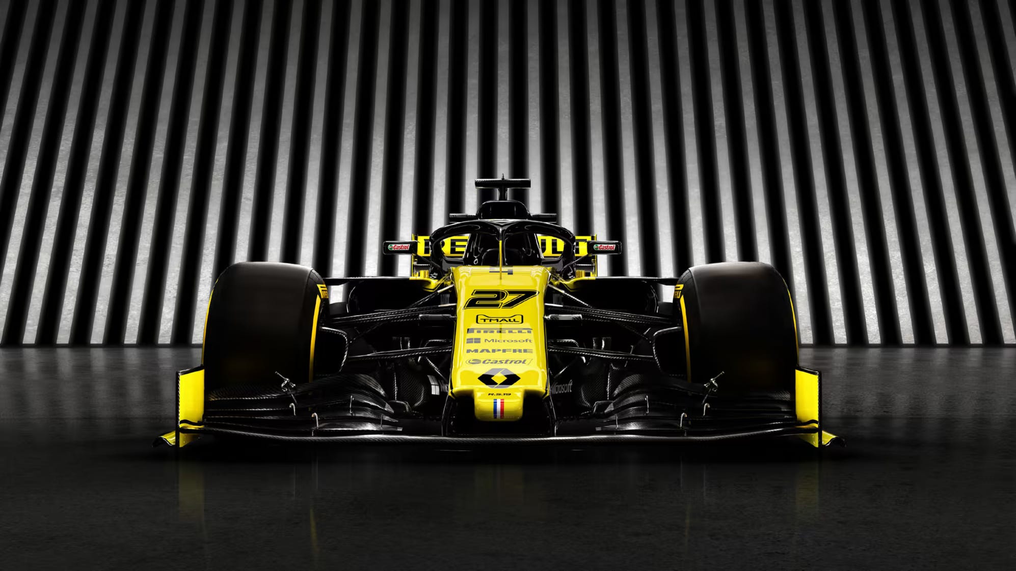
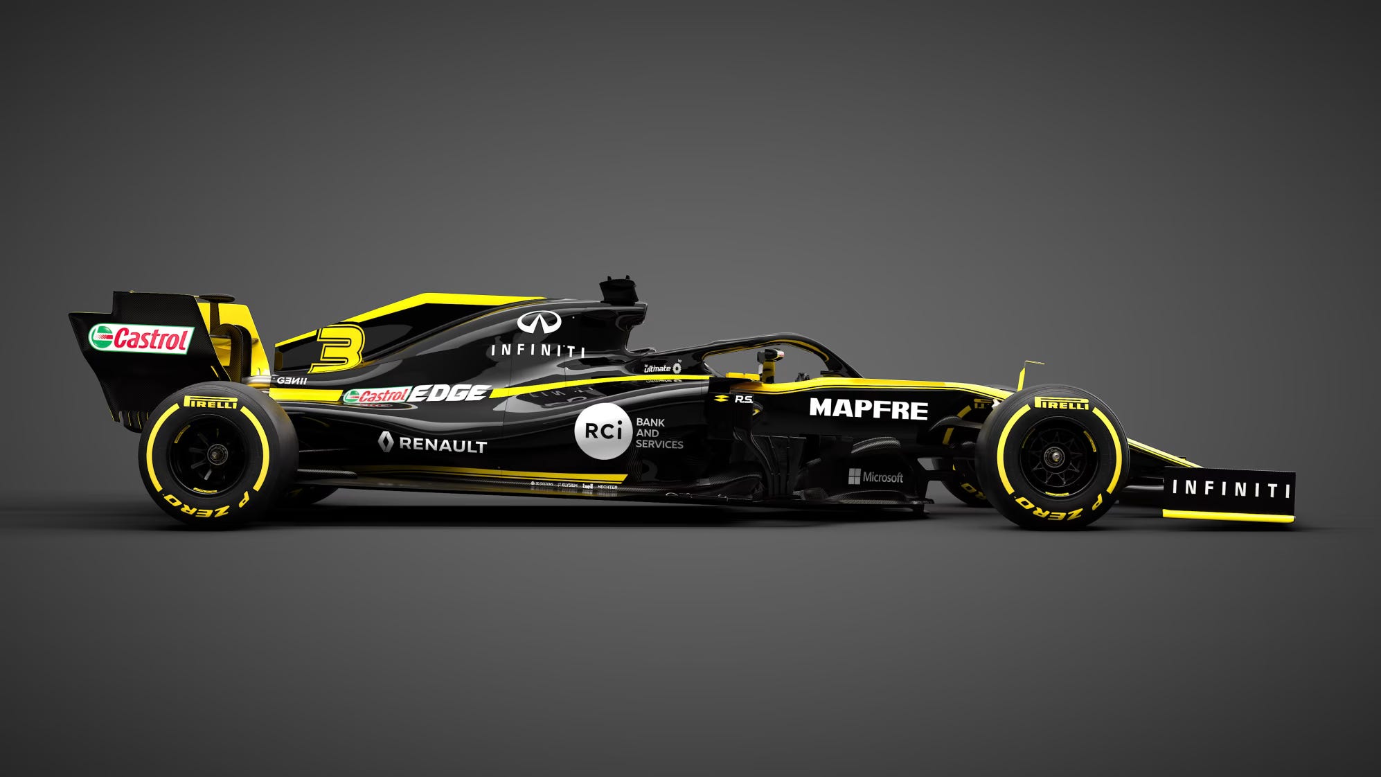
Let’s take the 2019 Renault R.S.19 for example. The car contrasts the bright yellow colours brilliantly with the black paint. From the front angle (as seen below), the viewer is greeted by a sea of yellow making it very eye-catching on TV. However, from the side, it is mainly black with yellow lines to break up the block colours. This is an example of how a mainly black livery has been done incredible well. Now lets look at the Alpine A524 for the 2024 season.
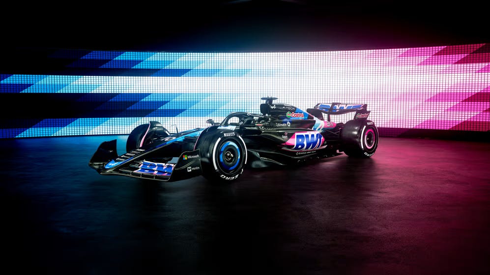
I actually quite like this livery (see below), but I can see why people were annoyed by it. Similarly to the R.S.19, it is predominantly black (even if its carbon fibre instead of paint). However, the designers for whatever reason decided to leave a long black empty space on the nose of the car. As a consequence, it creates an arguably boring TV and photograph presence as there are simply not many colours to pop.
Again, I would like to reiterate that I am in the minority that does not seem to mind this focus on carbon fibre as long as it is done well. But I think this issue of angles and obsession with doing it to save weight is what it annoying fans. We want teams to not only be creative technologically but also artistically with their livery. However, I must admit that there is now more colour on the grid than I thought there would be the panic that ensued after seeing the Haas VF-24!